Images to discuss
These are Labs from SunEd High's science department. Contact us smccrea@sunedhigh.com
Thursday, August 25, 2016
Tuesday, August 23, 2016
Science Project: How can we improve the ZERO WATER slide show?
Part of the course of Science at SunEd High is "PRESENTING INFORMATION."
 We ask students to make posters and slide shows (powerpoints) to explain what they have learned. How will you use the information that you learned?
What else do you want to learn?
PROJECT: Improve the slide show about Zero Water Filter
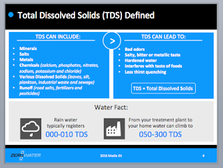
Here's are four slides from the Zero Water Filter company's "media kit."
What is positive about these pages?
What can we do to improve these pages?
See the SLIDE SHOW What are some rules about "making a good website or slide show"?
tinyurl.com/sunwaterproject
Here's what some websites advise us about "How to make a bad powerpoint presentation"
The interesting list comes from SETH GODIN. LINK
So What’s On Your Slides?
Here are the five rules you need to remember to create amazing PowerPoint presentations:
1. No more than six words on a slide. EVER.
2. No cheesy images. Use professional images from corbis.com instead. They cost $3 each, or a little more if they’re for ‘professional use’.
3. No dissolves, spins or other transitions. None.
4. Sound effects can be used a few times per presentation, but never (ever) use the sound effects that are built in to the program. Instead, rip sounds and music from CDs and leverage the Proustian effect this can have.
5. Don’t hand out print-outs of your slides. They’re emotional, and they won’t work without you there. If someone wants your slides to show “the boss,” tell them that the slides go if you go.
 We ask students to make posters and slide shows (powerpoints) to explain what they have learned. How will you use the information that you learned?
What else do you want to learn?
PROJECT: Improve the slide show about Zero Water Filter
Here's are four slides from the Zero Water Filter company's "media kit."
What is positive about these pages?
What can we do to improve these pages?
See the SLIDE SHOW What are some rules about "making a good website or slide show"?
tinyurl.com/sunwaterproject
 |
| Sign up for Seth's newsletter (FREE) |
Here's what some websites advise us about "How to make a bad powerpoint presentation"
The interesting list comes from SETH GODIN. LINK
So What’s On Your Slides?
Here are the five rules you need to remember to create amazing PowerPoint presentations:
1. No more than six words on a slide. EVER.
2. No cheesy images. Use professional images from corbis.com instead. They cost $3 each, or a little more if they’re for ‘professional use’.
3. No dissolves, spins or other transitions. None.
4. Sound effects can be used a few times per presentation, but never (ever) use the sound effects that are built in to the program. Instead, rip sounds and music from CDs and leverage the Proustian effect this can have.
5. Don’t hand out print-outs of your slides. They’re emotional, and they won’t work without you there. If someone wants your slides to show “the boss,” tell them that the slides go if you go.
Search Results
Seth Godin's Powerpoint presentation rules - YouTube
https://www.youtube.com/watch?v=b8TPx0d0Rls
Jul 6, 2009 - Uploaded by yBC.tv
http://www.yourbusinesschannel.com 1. Six words per slide max 2. No cheesy images 3. No transitions ...From Seth's presentation (blog) LINK
Second, make slides that reinforce your words, not repeat them. Create slides that demonstrate, with emotional proof, that what you’re saying is true not just accurate.
 Talking about pollution in Houston? Instead of giving me four bullet points of EPA data, why not read me the stats but show me a photo of a bunch of dead birds, some smog and even a diseased lung?
This is cheating! It’s unfair! It works.
Presentation Zen: The "Godin Method" of presentation design
Sep 28, 2005 - Can we call seth's presentation approach the "Godin Method"? (See the "
Here are other suggestions
Fix Your Really Bad PowerPoint by @slidecomet : based on an ebook ...
Jul 12, 2014 - REALLY POWERPOINT BAD based on the ebook by SETH GODIN ... THEM THE APPROVAL MAKE A SALE a presentation is to so make it!
Search Results
Top 12 Most Annoying PowerPoint Presentation Mistakes – The Visual ...
Sep 24, 2013 - Annoying Powerpoint presenatation mistakes: animating stuff ... Just as bad, if not worse visual presentations in many cases (trust me, Prezi doesn't .... The real problem is that presenters often use cheap clipart to make their ...
The 10 Most Common Presentation Mistakes
Even the best presentation can be destroyed by a bad presenter -- from the person ... do thepresentation without an electronic enhancement such as PowerPoint. ... Keep the most important points near the top of the slide for easy reading in ...
Six Major Mistakes When Doing Powerpoint Presentations - Lifehack
“Oh no, not another Powerpoint presentation – BORING! ... Another major mistake that many peoplemake is trying to fit in too much text on any single slide. ... From a presentation skills point of view, this is bad because the presenter loses eye ...
Subscribe to:
Comments (Atom)


